No items found.

As one of the birthplaces of American tourism, the Sullivan Catskills has always had history. What it needed was a symbol that could hold that legacy while inviting today’s traveler to discover something deeper.
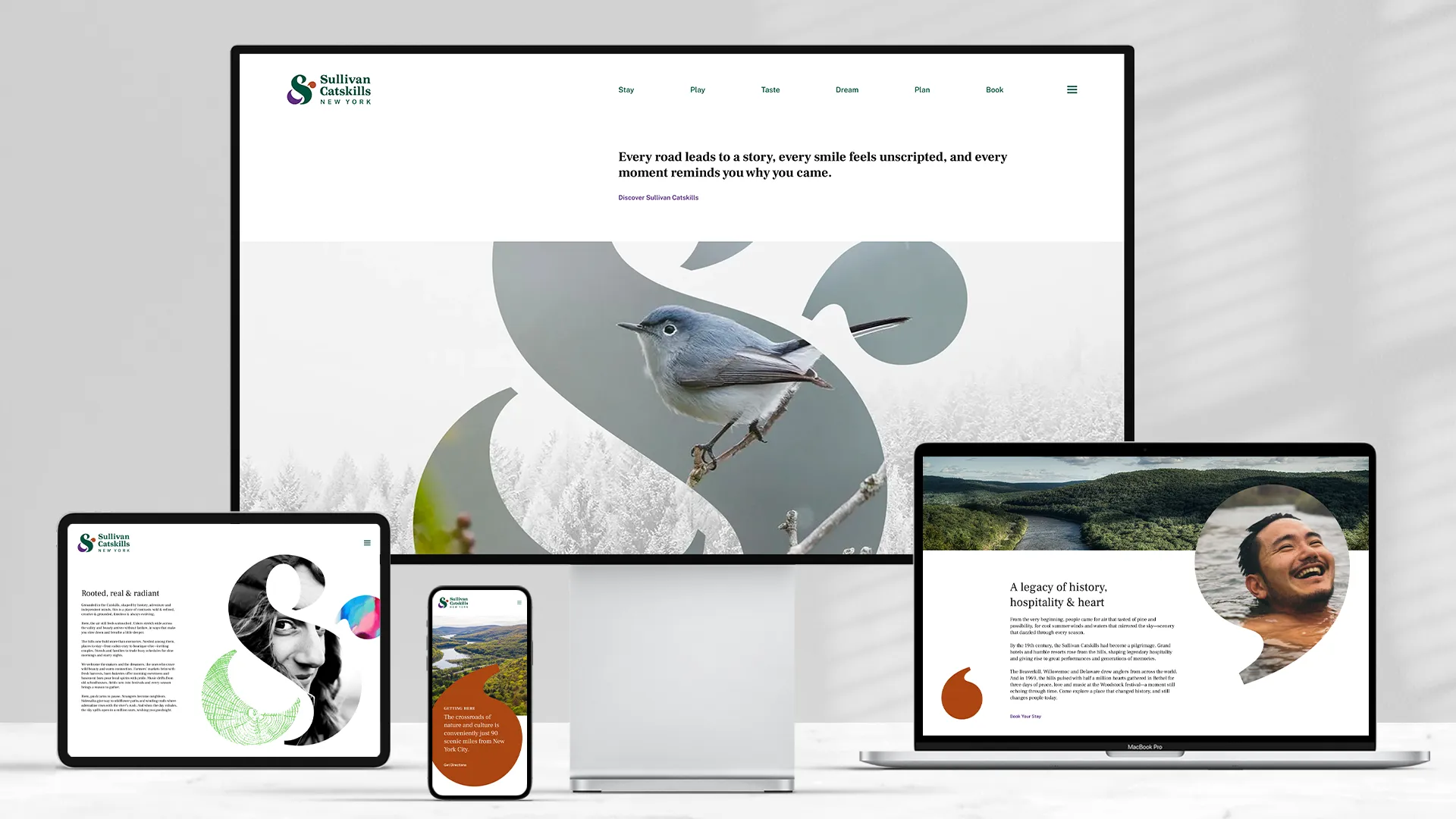
Genesis partnered with the Sullivan Catskills Visitors Association to create a new brand identity and digital experience that reflects the region’s soulful blend of unfiltered nature, unexpected culture, and small-town character.
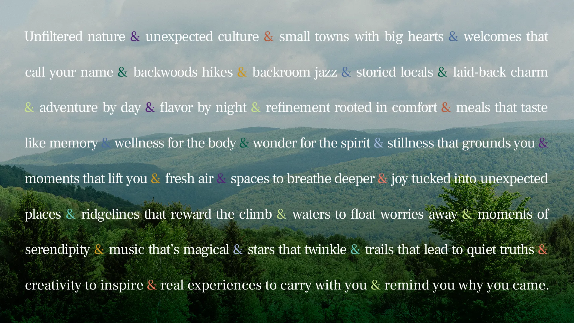
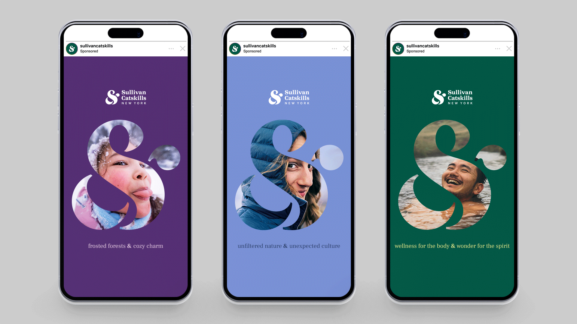
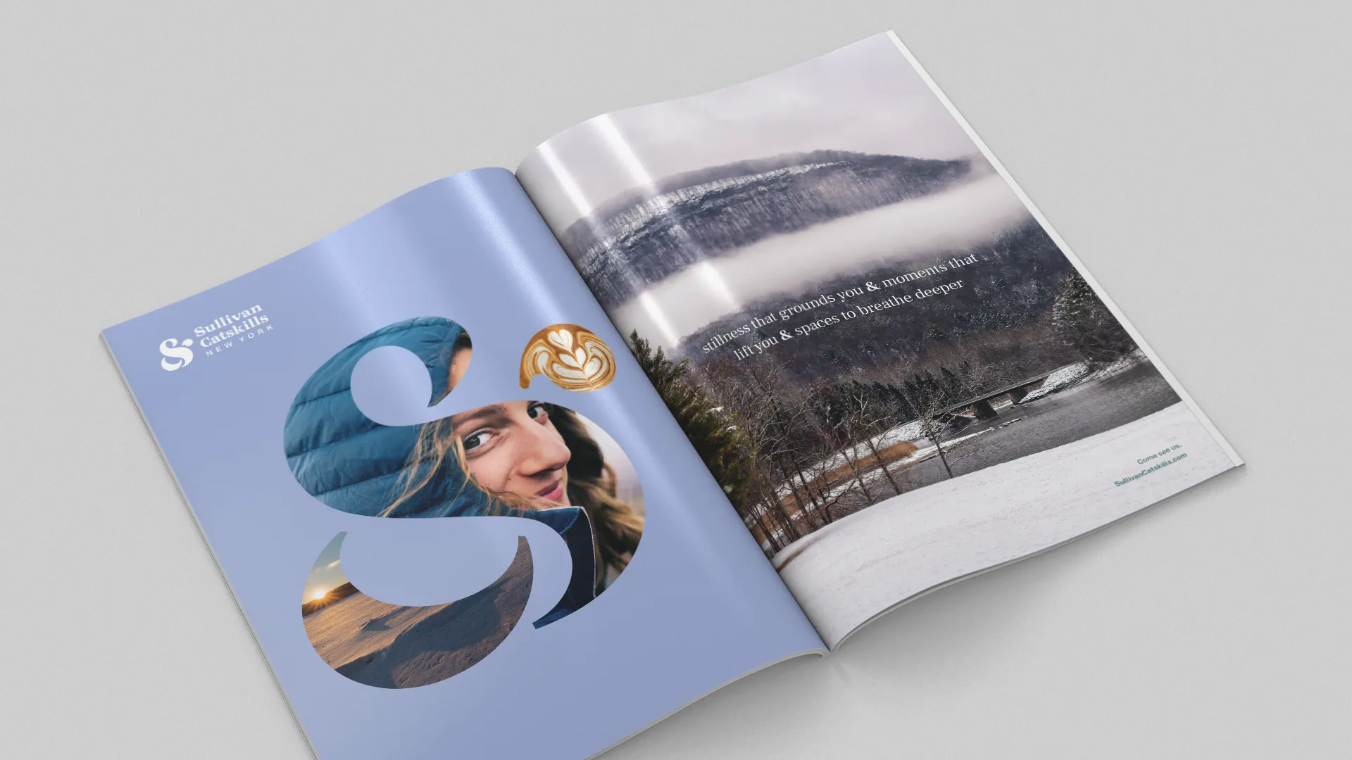
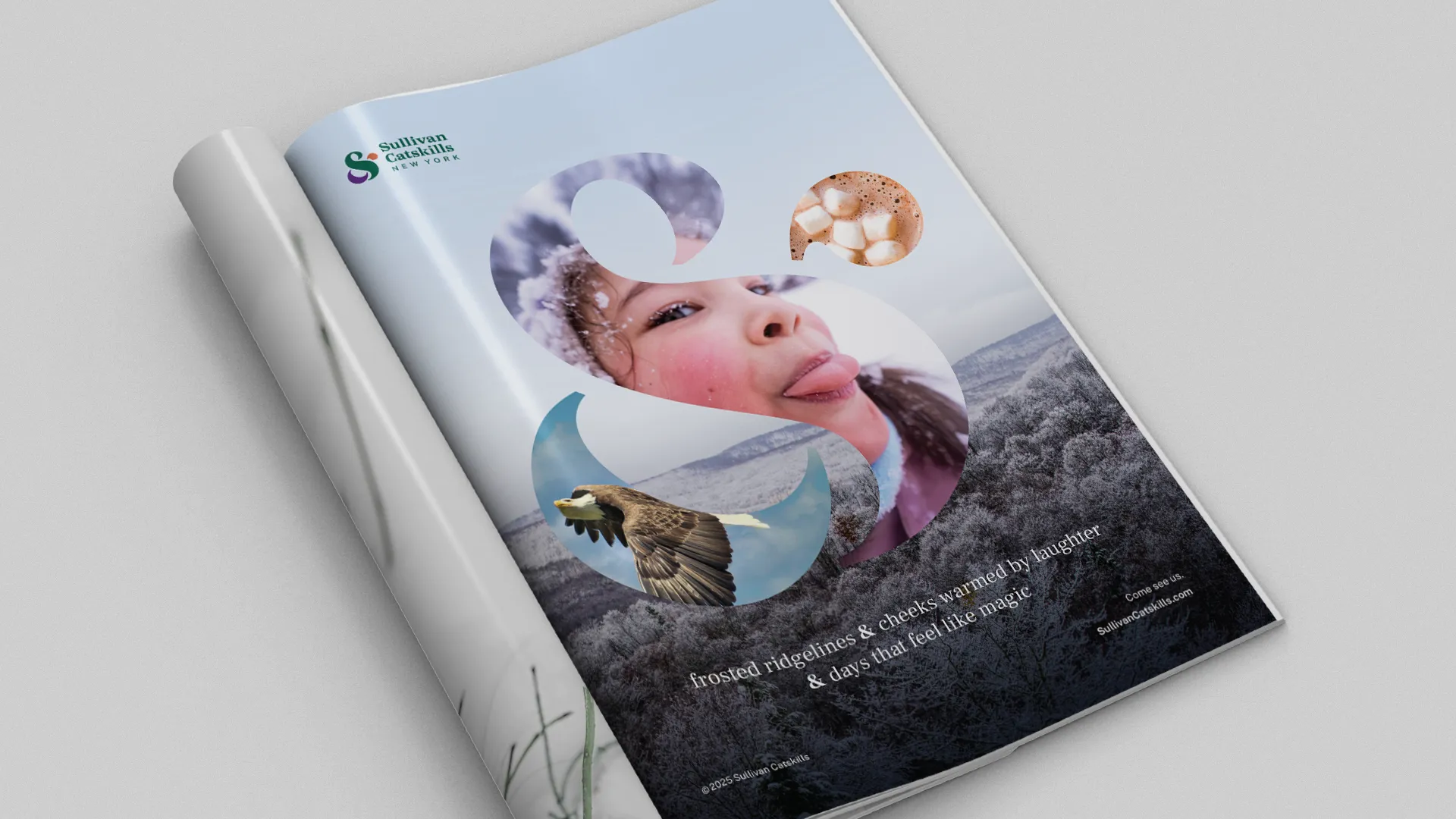
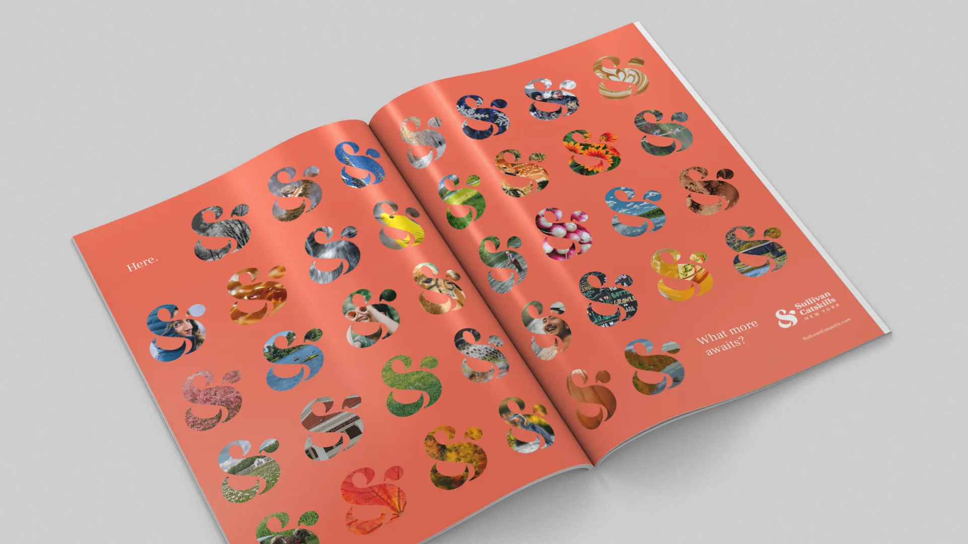
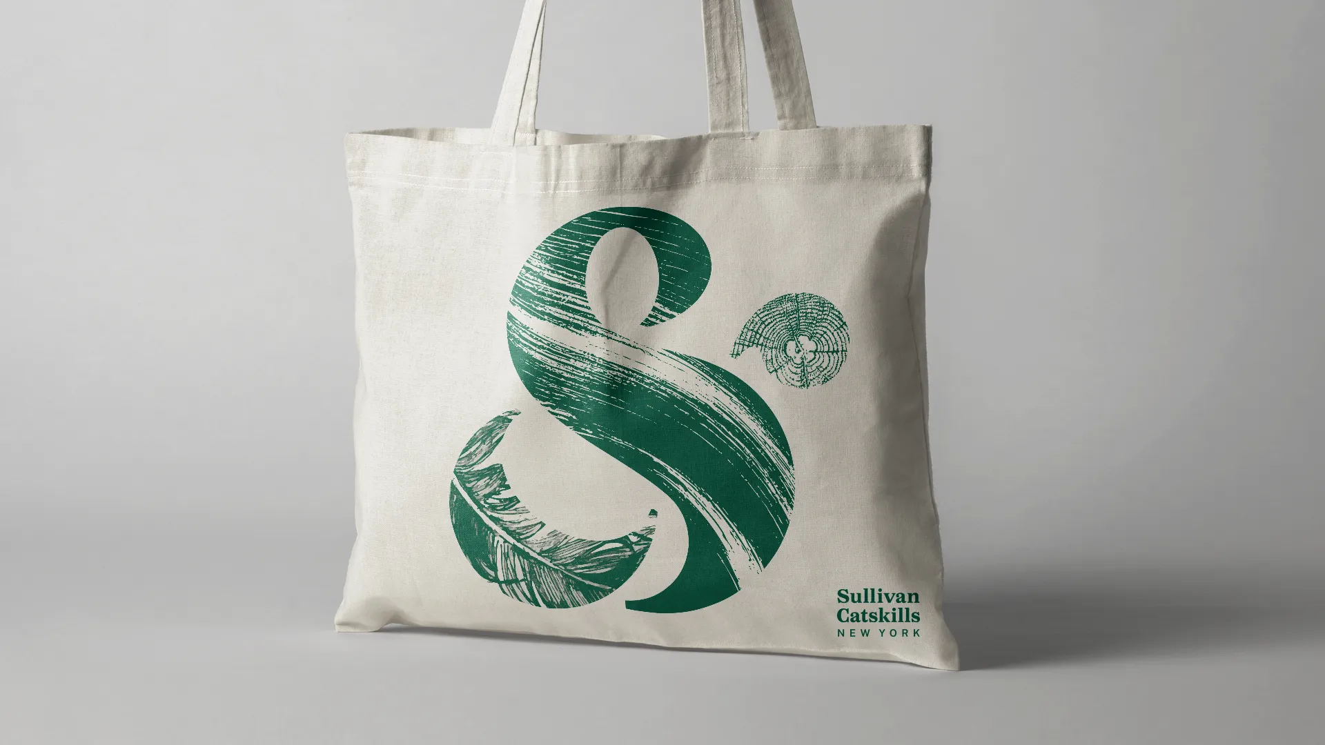
At the heart of the brand is a simple yet powerful symbol: the ampersand. Built from the initials “S” and “C,” it also reflects the 100+ towns, villages, and hamlets that make up Sullivan County; and the many dualities the region contains. Stillness & energy. Trout streams & jazz clubs. Fireflies & fireworks. It’s more than a logo. It’s a canvas for connection.
The visual identity is intentionally layered, with design elements that flex across digital, print, signage, and merchandise. The new website serves as the hub for this refreshed narrative, inviting users to explore, stay longer and feel something real.From a symbol with longevity to a brand that speaks with soul, this work honors the Catskills’ past while opening the door to what’s next.
Identity
Brand Guidelines
Website
Advertising
Video
Social